What makes a building iconic?
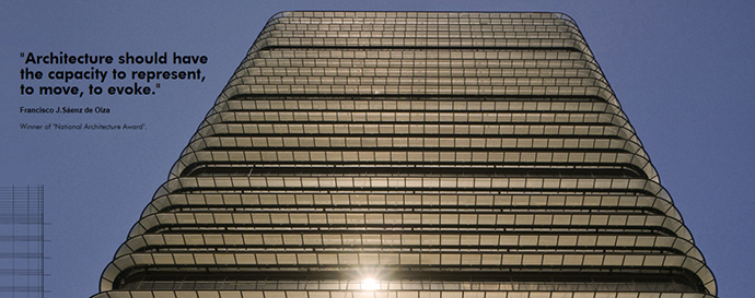
I recently visited Madrid for a design training workshop, hosted by our Spanish office. Strategy Plus and AECOM colleagues from all over the world came together on a hot summer day of June 2014 and, with a sense of “back to Uni” excitement, began with a tour of 81 Castellana, also known as Banco de Bilbao Tower or the BBVA Building.
81 Castellana was designed in 1979-1981 by much-respected Spanish architect Francisco Javier Sáenz de Oiza, who had already won various prizes including the Spanish National Architecture Award. Our Spanish colleagues described this building with enthusiasm, as an iconic building.
Image: http://www.castellana81.com/
There are many great examples of eye-catching commercial buildings to be found in London, such as the Shard, the “Gherkin”, and the “Walkie Talkie” Tower to name a few. But are they all iconic? An iconic design is a design that is “ground breaking” and that sets new standards in its field. Such design also stands up to the test of time, and can be admired as a good design despite the passing of years, decades and even centuries.
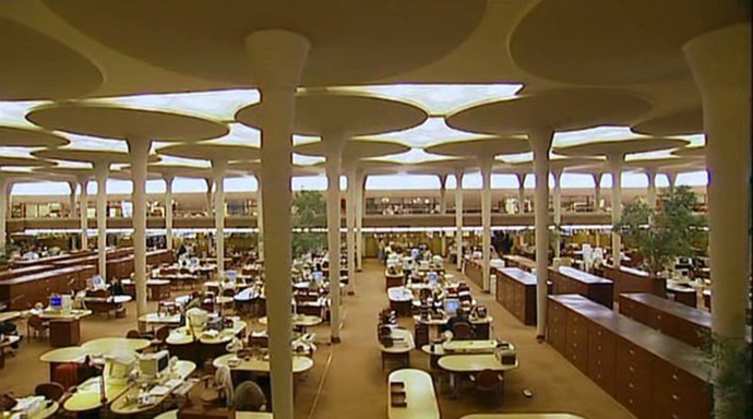
For me, the ultimate iconic office building is the Johnson Wax Headquarters and Administration building of S.C. Johnson & Son, by Frank Lloyd Wright.
Image: http://archidialog.com/tag/frank-lloyd-wright/
Johnson Wax Headquarter and Administration building was built in 1936-1939. It is Frank Lloyd Wright’s interpretation of Art Moderne style, a popular design concept developed in 1930s. Though the Great Workroom is notorious for acoustic problems, water leakage and, most infamously, trapped mice in its glass structure, its beauty and elegance still inspire us designers in 21st century.
When you love something, you see signs of it everywhere you turn. Maybe that’s why I see Frank Lloyd Wright’s “lily pads” everywhere. For example, I find the contour of Saarinen Table by Eero Saarinen has a striking resemblance to the lily pad design. I have specified this table for projects in the past, and its timeless elegance has always been appreciated by our clients.
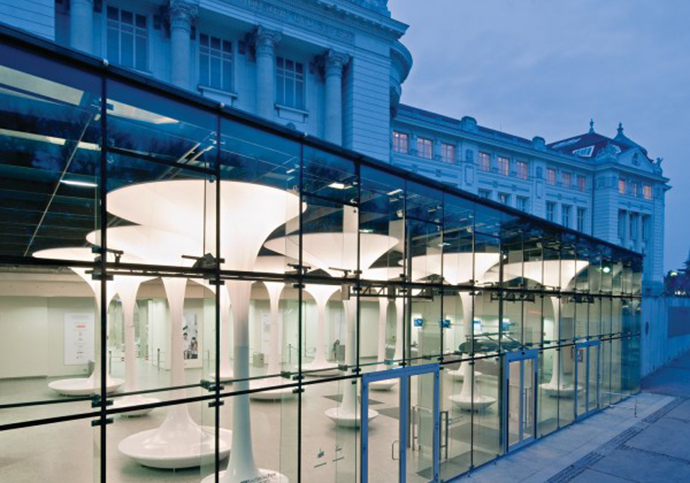
I also saw lily pad-inspired, tree-like objects within the foyer of TMW (Technical Museum Vienna). These ‘trees’ provide seating, shade and acoustic absorption, and also glow at night, filling the room with white and blue light. They are clearly an evolution of Frank Lloyd Wright’s vision – beauty and functionality!
Image: http://www.baunetz.de/architekten/querkraft_architekten_projekte_1333359.html
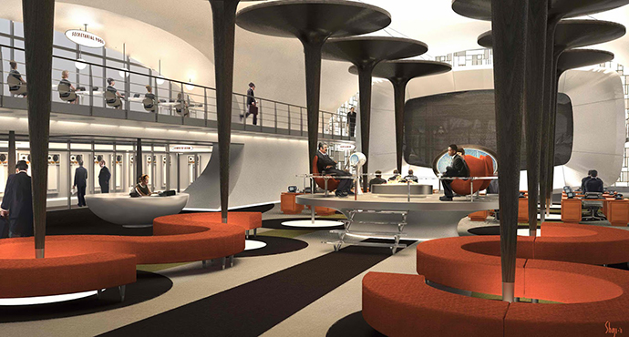
An iconic design is bound to make an appearance in popular culture. Concept artist Craig Shoji designed an office space for the film Men In Black III (2012) with dark, timber, lily pad-like structures. There is no clear function for these structures in this fictional space, yet one cannot deny that Frank Lloyd Wright’s creation is as visually appealing in this new incarnation, nearly eight decades after the original.
Image: http://filmsketchr.blogspot.ca/2012/05/men-in-black-iii-2012-concept-art-by.html
But should an iconic design always follow a formula of fame and visual appeal? There are many paths to greatness. Let’s come back to our building in Madrid. Is 81 Castellana/Banco de Bilbao Tower an iconic building? Why is this tower considered one of the most important architectural landmarks of Madrid, even though its overall design is perhaps not as dazzling as other Francisco Javier Sáenz de Oiza creations? Is its design still relevant in the 21st century?
Banco de Bilbao Tower was a new type of skyscraper derived from Oiza’s functionalism and rationalism. The facades have steel over-hung structure in every floor, which creates a walkway for cleaning windows and provides sunshades against the intense Spanish sun. It also has a continuous glass façade, which provides more than 180° panoramic views from every point in the office floors. This visual expansion softens the impact of the low ceiling height in many of the office floors, while maximizing floor space within the tower. With a rationalized central core, providing continuous unobstructed floor plates, the tower makes open workspace planning easy.
It also has several double-height floors, equally distributed throughout the tower. This vertical strategy offers an opportunity for spaces such as hub spaces, where staff can come together for knowledge-sharing and interactions, making the building attractive for sub-tenancy within the tower.
The choice of materials is equally important to the design. Its ochre-coloured exterior (due to the oxidation of its steel façade) and use of brass as an accent in the interior are definitely a recent design trend. Amongst many design elements, the cork ceiling and wall panels against an exposed concrete structure not only add visual warmth, but also provide superior sound absorption. Furthermore cork is an environmentally friendly, locally-sourced and sustainable material, affording the building additional green credentials.
These factors are key for successful office design. After my initial ignorance towards Banco de Bilbao Tower and the accomplishments of Oiza, I find that the design of 81 Castellana/Banco de Bilbao Tower is still hugely relevant, and feel it deserves the title of an ‘iconic’ building.
 Mariko Takeuchi Raouf is a consultant with AECOM’s Strategy Plus practice in London.


